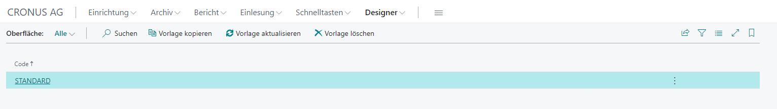
Interface
Under Designer → Interface, the cashiering interface can be configured.
The STANDARD template is always used as the base template and is created automatically during the initial BE-POS setup. It can be copied, for example as a template for a custom layout.
Actions
Copy Template
Creates a copy of the selected template under the name assigned afterwards. Both the interface setup and the button setup are copied.
Note: It is recommended to always copy the STANDARD template.
Update Template
Updates the selected template based on the standard template. This may be necessary if an update added new buttons to the standard template that did not yet exist when the copy was created.
Note: The STANDARD template serves as the copy template and therefore cannot be updated.
Delete Template
Deletes both the interface setup and the button setup for the selected template.
Note: The STANDARD template serves as the copy template and therefore cannot be deleted.
Setup
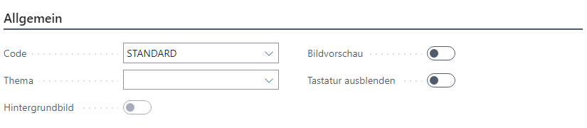
General
| Field | Description |
|---|---|
| Code | The unique design code |
| Theme | The optional design theme Standard: The classic BE-POS interface in grayscale Navision: An interface adapted to BC in plain white |
| Background Image | Indicates that a background image has been stored |
| Image Preview | Displays an image preview |
| Hide Keyboard | Hides the integrated touchscreen keyboard on all lookups |
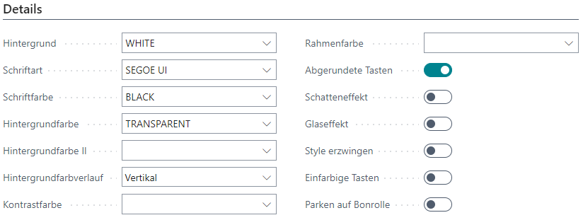
Details
| Field | Description |
|---|---|
| Background | Background color of this template |
| Font | Font |
| Font Color | Font color |
| Background Color | The background color of the buttons |
| Background Color II | The second background color of the buttons |
| Background Gradient | Type of gradient for the background colors |
| Contrast Color | Border color for button captions |
| Border Color | Border color of the buttons |
| Rounded Buttons | Defines whether the buttons are rounded or square |
| Shadow Effect | Applies a shadow effect to the buttons |
| Glass Effect | Defines whether the buttons should be semi-transparent |
| Enforce Style | Ignores system defaults for buttons and texts |
| Solid Color Buttons | Defines that the program cannot change the button colors |
| Park on Receipt Roll | Shows the Park Receipt button on the receipt roll |
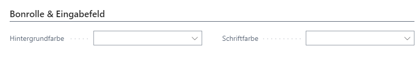
Receipt Roll & Input Field
| Field | Description |
|---|---|
| Background Color | Background color of the input field |
| Font Color | Font color of the input field |
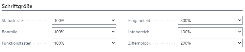
Font Size
| Field | Description |
|---|---|
| Status Bar | Font size of the status bar |
| Receipt Roll | Font size of the receipt roll |
| Function Buttons | Font size of the function buttons |
| Input Field | Font size of the input field |
| Info Area | Font size of the information display |
| Number Pad | Font size of the number buttons |